Monitoring a competitor who publishes no feed is the case every RSS guide skips. Twenty-one platforms sorted by which of three jobs they do, and the finished setup is business process automation you own outright, with no seat licence to renew.
Blaming the content is the reflex when a post underperforms, and it is usually the wrong diagnosis. A second reader decides distribution before any human sees the post, and most of what it checks is mechanical enough to automate business processes around, on five platforms at once.
Gloves on, tape measure in hand — nobody types a query. Three voice surfaces for ai automation tools (terminal, Telegram, Discord), 10 TTS and 6 STT providers compared on cost and latency, plus a setup that costs nothing.
YouTube Thumbnail Design: 7 Principles That Actually Boost CTR (With AI Workflows)
Design budgets were shaped by a constraint that no longer exists, and most teams have not redrawn them. Once variants are nearly free, money stops being the bottleneck and taste starts. That handover is the awkward part of any move to automate business processes.
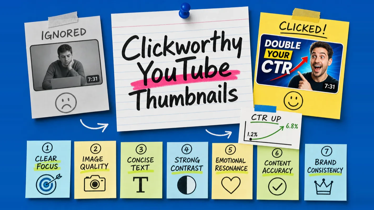
Your left thumbnail pulled 3,000 views. Your right one hit 300,000. The difference came down to three design principles — and the AI workflow that let you test five variants instead of guessing on one.
A thumbnail is not a frame grab. It is your video's first handshake with every potential viewer, and in a feed where 500+ hours of content upload every minute, that handshake determines whether anyone stops scrolling.
This guide focuses on YouTube thumbnail design principles, composition methods, and the AI workflows that implement them. Each principle comes with specific AI prompt templates you can drop into GPT Image, Midjourney, Ideogram, or Canva AI. Whether you are a beginner or an experienced creator looking to systematize your thumbnail pipeline, you will walk away with both the theory and the tools to act on it.
Each principle includes AI implementation: specific prompt templates for GPT Image, Midjourney, and Ideogram
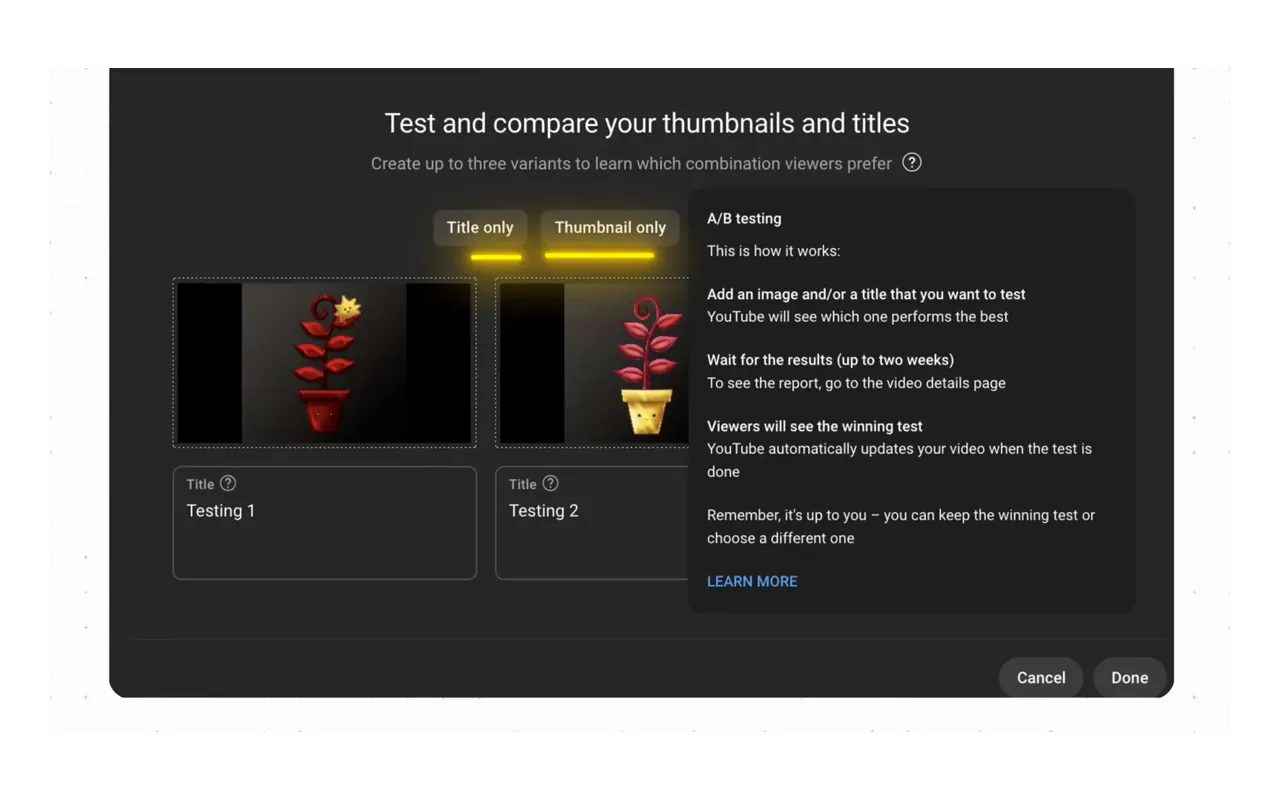
Build a thumbnail pipeline: generate 3-5 AI variants per video, A/B test with YouTube's Test & Compare
Thumbnails carry more weight on CTR than any other visual element — over 50% of the click decision
YouTube's native A/B testing (Test & Compare) now judges winners by watch-time share, not raw CTR
For most of the last decade you got one shot. A designer produced a thumbnail, it went live, and whether a different crop would have doubled the reach stayed unknowable, because the second version cost as much as the first. That constraint shaped how marketing teams spent their design budgets. Producing five variants for the price of a coffee removes it, and the scarce resource becomes judgement rather than money. The seven principles below give that judgement something to stand on: focus, contrast, text length, emotional read, accuracy, brand consistency. Cheap variants are an underrated reason to automate business processes.
CTR drop from cross-platform cropping (no adaptation)
28%
Thumbnail tool tests
Video uploaded per minute
500+ hours
YouTube Official
In a feed where 500+ hours upload every minute, your thumbnail is the only thing standing between your video and invisibility. The fact that 90% of top-performing videos use custom thumbnails is not a correlation — it is a prerequisite.
I was wrong about something early on: I assumed that great content would surface on its own. It does not. A video with a weak thumbnail is like a restaurant with no sign on the door. The food might be exceptional, but nobody walks in to find out.
The shift in 2026 is that AI tools now make it practical to apply every design principle systematically. Instead of hand-designing one thumbnail and hoping it works, you can generate multiple principle-compliant variants in minutes and let data decide the winner.
The 7 Core Principles of Effective Thumbnail Design
Principle
One-Line Summary
Common Mistake
Clear Focus
One focal point, instantly readable
Cramming 5 elements into a single frame
High-Quality Image
Sharp, well-lit, professional feel
Blurry screenshots, low-res stretching
Concise Text
3-5 words maximum
Rewriting the entire title on the thumbnail
Strong Contrast
Text and background visually separate
White text on a light background
Emotional Resonance
An expression that makes viewers want to click
Flat, passport-photo-style composition
Content Accuracy
Thumbnail matches what the video delivers
Clickbait imagery with no payoff
Brand Consistency
Recognizable color palette, font, layout
A completely different style every upload
Each of these thumbnail design principles deserves a closer look. For every principle, I break down the design logic and then show you exactly how to implement it with AI tools.
Principle 1: Clear Focus
Humans process images faster than text. In a scrolling feed, viewers give each thumbnail less than one second of attention. If they cannot parse the subject in that window, they scroll past.
Actionable rules:
One primary subject per thumbnail (a person or an object)
The subject occupies 40-60% of the frame
Background stays simple — it supports the subject, never competes with it
Multiple elements need a clear visual hierarchy through size, color, or position
The phone test: Shrink your thumbnail to approximately 168x94 pixels (the size it appears on a mobile feed). If you cannot describe what the image shows within one second, the thumbnail fails. I run this test on every single thumbnail before publishing. I also ask someone who has no context about the video to look at the shrunk version — if they can identify the core message instantly, it passes. This five-second exercise catches more problems than any design theory.
How to implement with AI:
The key to clear focus in AI generation is being explicit about subject dominance and background simplicity. Most AI generators default to filling the entire frame with detail — you need to override that tendency.
GPT Image prompt template (clear focus):
YouTube thumbnail, 16:9 aspect ratio. A single [subject description]
occupying the center 50% of the frame. Clean [color] gradient background
with no distracting elements. Shallow depth of field so the subject is
sharp and the background is softly blurred. High saturation, professional
studio lighting.
Midjourney prompt template:
[subject description], centered composition, occupying 50% of the frame,
clean simple [color] gradient background, shallow depth of field,
studio lighting, YouTube thumbnail style, minimal background detail
--ar 16:9 --q 2 --v 7 --no clutter, busy background, multiple subjects
Canva AI approach: Start with Canva's "YouTube Thumbnail" template. Use Magic Edit to remove background clutter from your photo. Canva's background remover isolates the subject instantly — then drop it onto a solid or gradient background.
Principle 2: High-Quality Image
A blurry, pixelated, or underlit thumbnail sends an immediate signal: this is low-quality content. Viewers make that judgment before they read a single word.
Technical specifications:
Resolution: 1920 x 1080 pixels (recommended); 1280 x 720 minimum
Format: JPG or PNG, under 2MB
Aspect ratio: 16:9 (mandatory)
Color mode: sRGB
YouTube has been pushing creators toward the higher resolution spec because more viewers now browse on 4K monitors and high-DPI phone screens. Thumbnails designed at 1280x720 look noticeably soft on these devices.
How to implement with AI:
AI image generators solve the resolution problem by default — most produce high-resolution output. The real challenge is controlling the "AI look" that screams artificial.
Tool
Native Output Resolution
Upscale Options
GPT Image
Up to 1536x1024 (landscape)
Request "high resolution" in prompt
Midjourney V7
1024x1024 base, upscale to 2048+
--q 2 for quality, upscale button in UI
FLUX 1.1 Pro
1024x1024 base
UI resolution controls
Ideogram 3.0
Up to 2048x2048
Resolution selector in UI
GPT Image prompt template (high quality):
Photorealistic YouTube thumbnail, 16:9 aspect ratio, ultra-high resolution.
[Subject description]. Professional photography quality with sharp focus,
correct skin texture, natural lighting. No AI artifacts, no uncanny valley
effects, no extra fingers. Shot with a Canon EOS R5, 85mm f/1.4 lens.
Adding camera and lens specifications steers AI generators toward photorealistic output with natural bokeh and skin tones — a technique that consistently produces more professional-looking results.
Principle 3: Concise Text
Thumbnail text supplements the title. It does not replace it.
Rule
Good Practice
Bad Practice
Word count
3-5 words
Full sentences or paragraphs
Font size
Large enough to read at phone scale
Small text that vanishes when shrunk
Font weight
Bold sans-serif (Impact, Montserrat Bold, Inter Bold)
Thin, script, or decorative fonts
Information
Adds something the title does not
Repeats the title word-for-word
Placement
Does not block the subject's key features
Covers the face or focal point
The complementary relationship between thumbnail and title is critical. If your title says "The Fastest Way to Edit Videos," your thumbnail should show something like "3-Minute Cuts" or a dramatic before/after — not the same words again. Together, they give the viewer twice the information they would get from either one alone.
How to implement with AI:
The critical mistake is trying to generate text inside the AI image. Most generators still produce garbled, misspelled text. The professional approach is a two-step pipeline: AI generates the base image with reserved text space, then you add text in a dedicated tool.
GPT Image prompt template (text space reserved):
YouTube thumbnail, 16:9 aspect ratio. [Subject description] positioned
on the left 60% of the frame. The right 40% is a clean [color] area
with no detail, reserved for text overlay. High contrast between the
subject side and the text area side. No text in the image.
Ideogram exception: If you must have text baked into the image, Ideogram 3.0 is the one tool that handles it reliably. Prompt with the exact text in quotes:
YouTube thumbnail with bold text "YOUR TEXT" in white Impact font,
[subject description], [background color], high contrast, 16:9
Post-production text overlay workflow:
Generate base image with reserved space (GPT Image / Midjourney)
Import into Canva AI → use "Magic Write" to generate 5 text variations
Apply bold sans-serif font at 72-96pt
Add text stroke (2-3px black outline) for contrast on any background
Preview at 168x94 px mobile size — if text blurs, increase size or reduce word count
Principle 4: Strong Contrast
Contrast determines whether your thumbnail "pops" out of the feed or dissolves into it.
Contrast checklist:
Text and background differ by at least two brightness levels
Subject and background create color contrast (warm vs. cool, light vs. dark)
Complex backgrounds need text outlines or semi-transparent backing
Avoid mid-gray tones — they blend into every background
Here is a practical rule I follow: after finishing a thumbnail, I convert it to grayscale. If the text and subject still stand out clearly without color, the contrast is strong enough. If anything blends together in grayscale, it will underperform in the feed.
How to implement with AI:
AI tools excel at contrast when you specify complementary color pairs explicitly. Do not leave color choices to the model's default — it tends toward safe, muted palettes.
GPT Image prompt template (high contrast):
YouTube thumbnail, 16:9 aspect ratio. [Subject description] lit with
warm orange side lighting against a deep blue-black background.
Complementary color contrast: warm subject against cool background.
High saturation, cinematic color grading. The subject should visually
"pop" from the background with clear edge separation.
Midjourney prompt template (contrast):
[subject description], dramatic complementary color contrast,
warm orange highlights against deep blue shadows, strong rim lighting
separating subject from background, high saturation, cinematic,
YouTube thumbnail style --ar 16:9 --q 2 --v 7 --no muted, desaturated,
flat lighting
Color pair cheat sheet for AI prompts:
Color Pair
Prompt Keywords
Best For
Blue-Orange
"warm orange against deep blue"
Tech, business, travel
Red-Green
"vibrant red subject on dark green backdrop"
Food, fitness, holiday
Yellow-Purple
"bright yellow highlights with purple shadows"
Comedy, education, gaming
White-Black
"high key white with deep black accents"
Minimalist, luxury, tutorials
Principle 5: Emotional Resonance
Facial expressions are the most powerful emotional signal in a thumbnail. YouTube's own data shows that thumbnails with close-up human faces consistently outperform purely object-based or text-based designs.
Emotion intensity reference:
Emotion
Low Intensity (Lower CTR)
High Intensity (Higher CTR)
Surprise
Slightly raised eyebrows
Wide eyes, open mouth
Joy
Polite smile
Genuine laugh with squinted eyes
Tension
Neutral expression
Clenched jaw, furrowed brow
Curiosity
Slight head tilt
Hand on chin, wide-eyed stare
Thumbnail expressions need to be theatrical — the kind of expression that would feel overdone in a normal conversation reads as perfectly appropriate at thumbnail scale.
A practical tip for shooting thumbnail photos: instead of telling yourself to "look surprised," imagine a specific scenario — you just opened a package containing exactly the thing you wanted most. Scenario-driven expressions look far more natural than mechanically posed ones, while still being dramatic enough to read at small sizes.
There is an important nuance in 2026: viewers are developing fatigue toward AI-generated hyper-perfect facial expressions. Data shows that thumbnails with real human micro-expressions outperform purely AI-generated faces by about 22% in long-term click satisfaction. The logic is straightforward — viewers can subconsciously detect when a face does not look quite real, and that uncanny feeling reduces trust and click willingness. My recommendation: use real photos for faces, especially close-ups. AI works well for generating backgrounds, supplementary elements, and non-face subjects.
How to implement with AI:
For faces, the best approach is hybrid: photograph real expressions, then use AI to enhance or composite.
GPT Image prompt template (background for real face composite):
YouTube thumbnail background only, 16:9 aspect ratio, no people.
[Dramatic scene or gradient] with strong [color] lighting. Leave the
center-left area clean for a human face cutout to be composited in.
Professional studio atmosphere. High contrast, high saturation.
For non-face thumbnails where AI handles the full image:
YouTube thumbnail, 16:9 aspect ratio. [Character description] with
exaggerated [emotion] expression — wide eyes, [open mouth / clenched jaw
/ squinted eyes laughing]. Close-up portrait from chest up. Dramatic
studio lighting with [color] rim light. The expression should read clearly
even when the image is shrunk to 168x94 pixels.
Midjourney for stylized emotional characters (non-photorealistic):
A cartoon-style character with extremely exaggerated shocked expression,
jaw dropped, eyes bulging, hands on cheeks, vibrant pop art style,
bold outlines, bright yellow background, YouTube thumbnail composition,
centered close-up --ar 16:9 --q 2 --v 7 --style raw
Principle 6: Content Accuracy
YouTube's algorithm penalizes misleading thumbnails more aggressively than ever. A thumbnail that drives clicks but triggers immediate bounces tanks your retention metrics, and the algorithm responds by suppressing distribution — a net negative for your channel.
The boundary: You can dramatize your results, but you cannot fabricate them. Showing an outcome in a more visually striking way is fair game. Showing content that your video never delivers is not.
In 2026, YouTube's recommendation system weighs viewer satisfaction signals more heavily than raw clicks. A 10% improvement in retention can produce a 25% increase in impressions. Misleading thumbnails undercut the exact metric the algorithm now prioritizes.
How to implement with AI:
AI makes it tempting to generate fantastical imagery that has nothing to do with your actual content. Resist that temptation. Instead, use AI to make your real content look more visually compelling.
Practical workflow for accuracy:
Watch your own video and identify the single most interesting visual moment
Describe that moment in your AI prompt — the actual content, dramatized but not fabricated
If the video is a tutorial, prompt for a before/after showing the real transformation
If the video is a reaction, prompt for the emotional response to the actual subject
GPT Image prompt template (accurate dramatization):
YouTube thumbnail, 16:9 aspect ratio. [Accurate description of your
video's core content or result], presented in a visually dramatic way.
[Specific visual elements that actually appear in the video]. High
saturation, professional lighting. This should honestly represent
the video's content while being visually striking enough to earn a click.
Principle 7: Brand Consistency
When viewers see your thumbnail in a recommendation feed, they should recognize it as yours before reading the channel name.
The four elements of brand consistency:
Element
What It Means
Example
Primary color
A consistent dominant hue across thumbnails
Always using a blue palette
Font
The same typeface on every video
One bold sans-serif, used everywhere
Layout
Fixed positioning of elements
Person on the left, text on the right
Processing style
Unified post-production look
A consistent color grading preset
Brand consistency compounds over time. Early on, each thumbnail competes as an individual. Over months, consistent styling builds pattern recognition — returning viewers click faster because they trust the source before even reading the title.
How to implement with AI:
AI tools offer powerful consistency features that most creators overlook.
Midjourney style locking:
--sref [URL of your brand reference image] — forces the model to match the visual style of a reference
--cref [URL of your character image] — maintains the same character appearance across thumbnails
Save your "golden" thumbnail seed value and reuse it: --seed 12345
GPT Image brand consistency workflow:
YouTube thumbnail, 16:9 aspect ratio. Use the following brand system:
- Primary color: [your hex code or color name]
- Style: [your consistent style, e.g., "clean minimalist with bold
  sans-serif text area"]
- Layout: [your fixed layout, e.g., "subject on left 60%, text area
  on right 40%"]
- Mood: [your consistent mood, e.g., "professional but approachable,
  high contrast"]

Subject for this video: [specific subject description]
Canva AI brand kit: Upload your brand colors, fonts, and logo into Canva's Brand Kit. Every thumbnail you create automatically inherits your palette — Magic Design generates template suggestions that match your existing style.
5 Thumbnail Design Composition Methods That Work
1. Center Composition
Subject placed dead center. Best for headshot-style content, product reviews, or any video where a single subject dominates. It is the most forgiving composition for beginners — hard to get wrong.
One refinement: Pure center symmetry can feel static. Shift the subject 5-10% off-center, or introduce a slight angle to add visual energy without losing the simplicity.
AI prompt keyword:centered composition, subject in the middle of the frame
2. Rule of Thirds
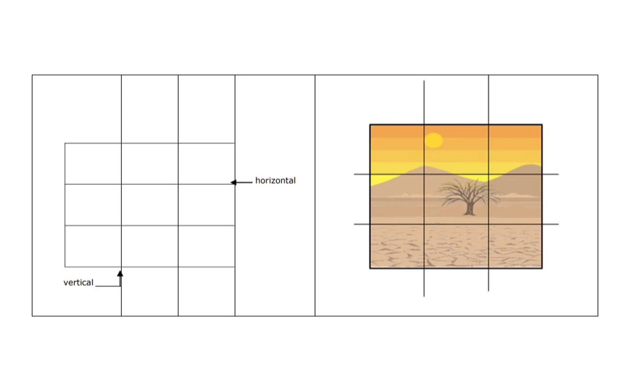
Divide the frame into a 3x3 grid and place the subject on an intersection point. This is the most established composition framework — it creates breathing room and visual balance.
Best for: Vlogs (person offset to one side, text on the other), landscape content (horizon on the upper or lower third line).
Optimal text placement: Person on the left third, large text filling the right two-thirds.
AI prompt keyword:rule of thirds composition, subject on the left intersection point, empty space on the right for text
3. Diagonal Composition
Key elements arranged along a diagonal line. Creates movement and tension in the frame.
Best for: Gaming (character charging diagonally), sports (motion trails), tech (product angled for dynamism).
AI prompt keyword:dynamic diagonal composition, subject angled from lower-left to upper-right
4. Before/After Split
Left-right or top-bottom division showing a transformation. The format inherently triggers curiosity — viewers want to see how the change happened.
Best for: Tutorials (editing before/after), fitness (body transformation), home renovation.
Critical detail: Add a clear dividing line or directional arrow between the two halves. Without a visual separator, the comparison reads as a single cluttered image.
AI prompt keyword:split composition, left half showing [before state], right half showing [after state], clear vertical dividing line
5. Whitespace Composition
Large areas of negative space with a small but highly prominent subject. Pairs well with large text overlays.
Best for: Educational content (clean background + bold title + small subject), minimalist aesthetic channels.
AI prompt keyword:minimalist composition, small subject with large areas of clean negative space, room for text overlay
Thumbnail Design Color Theory: 5 Practical Rules
High saturation stands out in feeds. Muted, desaturated thumbnails disappear among competitors. Bumping saturation by 10-20% is a safe improvement that avoids looking artificial.
Maintain at least two brightness levels between subject and background. Dark subject on a light background, or the reverse. This is non-negotiable for readability.
Limit each thumbnail to three colors maximum. One dominant, one supporting, one accent. More than three creates visual noise.
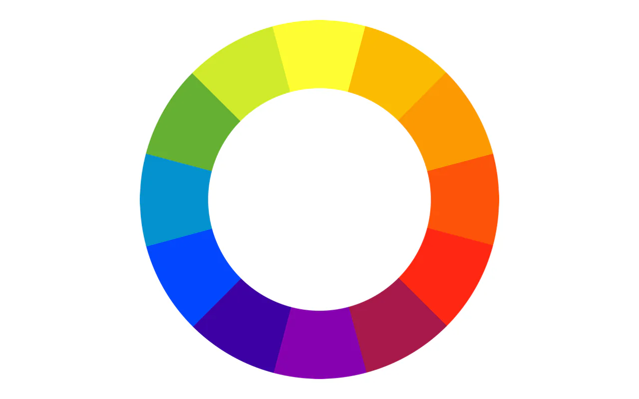
Use complementary colors for impact. Blue-orange, red-green, yellow-purple — these pairings produce maximum contrast at small sizes.
Base your color choice on competitor analysis, not preference. Search your target keyword, screenshot the top 10 results, and identify the dominant color patterns. Then choose a color that breaks the pattern. If every competitor uses blue, go orange. If everyone is colorful, use a clean single-color background. This competitor-driven color strategy outperforms gut-feel decisions every time.
My experience after testing across 100+ thumbnails: red and yellow generate the highest click rates as primary thumbnail colors, but if your channel's identity leans toward a calmer aesthetic, blue with high-contrast text works equally well. I spent months chasing "the perfect color" before realizing the question was wrong. The question is never "which color is best" — it is "which color makes your thumbnail jump out of the specific feed where it appears."
AI color implementation tip: When prompting AI tools, specify exact color relationships rather than generic terms. "Warm orange subject lighting against cool teal background" produces dramatically better contrast than "colorful and vibrant." Every color rule above can be encoded directly into your AI prompts.
Thumbnail Design Typography Rules
Keep it short. 3-5 words is the optimal range. Thumbnail text supplements the title — it is not a substitute for it.
Go large. Thumbnails display at fingertip size on mobile. Text that looks reasonable at full size becomes invisible when shrunk.
Use bold weights. Thin fonts collapse into lines at small sizes. Impact, Montserrat Bold, and Inter Bold are reliable choices.
Make text and title complementary. Thumbnail says "3-Day Results" while the title says "The Fastest Weight Loss Method" — together they tell a more complete story than either alone.
Verify mobile readability. Shrink the thumbnail to 168x94 pixels. If any text blurs, either increase the font size or reduce the word count.
"soft diffused studio lighting, clean pastel background"
Tech
Product shot + key spec
Physical product, comparison numbers
Dark base + blue accents
"product photography, dark gradient background, blue rim light"
Gaming
Character + dynamic scene
Neon glow, high contrast
Neon colors, dark backgrounds
"cyberpunk neon lighting, dynamic diagonal, high contrast"
Education
Bold title + simple icon
Clean background, arrows, question marks
Blue, white, green
"clean minimalist, bright even lighting, white background"
Comedy
Exaggerated expression
Wide eyes, open mouth, arrow callouts
High-saturation, bright
"exaggerated expression, pop art style, bold solid color bg"
Finance
Charts + numbers
Up/down arrows, currency symbols
Green, red, dark backgrounds
"corporate photography, dramatic side lighting, dark bg"
Travel
Scenic vista + person
Blue sky, ocean, landmarks
Natural, vivid landscape tones
"golden hour lighting, wide landscape, vivid sky"
Build Your Thumbnail Workflow: From Principle to Production
The gap between knowing design principles and applying them consistently is a workflow gap. Here is the systematic pipeline I use to turn every video into 3-5 tested thumbnail variants in under 30 minutes.
The 5-Step AI Thumbnail Pipeline
Step 1: Analyze (3 min) — Before generating anything, answer three questions:
What is the single core message of this video?
Which of the 7 design principles matters most for this topic? (usually 2-3 dominate)
What are the top 5 competitors doing? (search your target keyword, screenshot the thumbnails)
Step 2: Prompt (5 min) — Build your prompt using this master template:
YouTube thumbnail, 16:9 aspect ratio, 1920x1080 resolution.

SUBJECT: [One primary subject description, occupying 40-60% of frame]
EMOTION: [Specific expression if face, or visual energy if object]
COMPOSITION: [Center / Rule of thirds / Diagonal / Split / Whitespace]
CONTRAST: [Specific complementary color pair, e.g., "warm orange vs deep blue"]
BACKGROUND: [Simple description, clean, supporting the subject]
TEXT SPACE: [Where to reserve empty area for text overlay]
STYLE: [Photorealistic / Illustration / Cartoon / Cinematic]
LIGHTING: [Specific lighting setup]

No text in the image. High saturation. Professional quality.
Step 3: Generate variants (10 min) — Produce 3-5 variants, each varying one design variable:
Variant A: Base design (your best prompt)
Variant B: Different emotion/expression
Variant C: Different color scheme (try the complementary pair opposite to A)
Variant D: Different composition (if A is centered, try rule of thirds)
Variant E: Different background style
Step 4: Post-produce (7 min) — For each surviving variant:
Import into Canva or Photoshop
Add text overlay (3-5 words, bold sans-serif, stroke outline)
Boost saturation 10-15%
Run the phone test at 168x94 px
Export at 1920x1080, JPG or PNG, under 2MB
Step 5: Test (5 min upload, then ongoing) — Upload your top 3 variants to YouTube's Test and Compare. Mark the date. Check results after 48 hours and again at 14 days.
Automation for Repeat Workflows
If you publish regularly, build a reusable system:
Prompt library spreadsheet — Track every thumbnail prompt with these columns:
Column
Purpose
Video title
Reference
Prompt text
Full prompt used
AI tool
Which model generated it
Design principles applied
Which of the 7 principles you optimized for
CTR result
Actual performance data
Rating
Template-grade / Decent / Retire
After 20-30 entries, you have a personal prompt database. New thumbnails start from proven templates instead of blank pages. Review monthly — flag top CTR performers as "template-grade" and reuse their prompt structure.
Brand template in Canva AI — Create a master template with your brand colors, font, and layout locked in. For each new video, duplicate the template, swap the AI-generated base image, and update the text. Total post-production time: under 5 minutes.
Batch generation for series content — If you produce a recurring series, use Midjourney's --sref and --cref parameters to lock visual style and character appearance. Generate all episode thumbnails in one session, varying only the subject and text.
A/B Testing with AI-Generated Variants
Thumbnail A/B testing is where AI integration delivers the clearest ROI. Instead of manually designing 2-3 options, AI lets you test variables systematically.
The Variable Isolation Method
Most creators test random variations. That tells you which thumbnail won, but not why. A better approach: isolate one design variable per test.
Test Round
Variable Isolated
Variant A
Variant B
Variant C
Round 1
Emotion
Shocked expression
Confident smile
Curious head tilt
Round 2
Color scheme
Blue-orange contrast
Red-green contrast
Yellow-purple contrast
Round 3
Composition
Centered
Rule of thirds
Diagonal
Round 4
Text vs no text
3-word overlay
No text, image only
Single word + icon
How to generate test variants efficiently:
Take your winning prompt from Round 1 and change only the test variable for Round 2. Everything else stays identical. This isolation is what turns A/B testing from guesswork into actionable data.
GPT Image makes this easy with conversational iteration: After generating your base thumbnail, say "Now create the same image but change the color scheme from blue-orange to red-green. Keep everything else identical." GPT Image maintains context within a conversation, so each variant stays consistent except for the isolated variable.
YouTube Test and Compare Workflow
YouTube's Test and Compare feature received a significant update in 2026. You can now upload up to three thumbnail variants, and YouTube automatically splits traffic for concurrent testing. The key change: the winning variant is now selected based on watch-time share rather than raw CTR. A thumbnail that generates lots of clicks but poor retention loses to one with fewer clicks but longer viewing sessions. This shift rewards honest, well-designed thumbnails over misleading ones.
Recommended testing cadence:
Every new video: Upload 3 AI-generated variants to Test and Compare
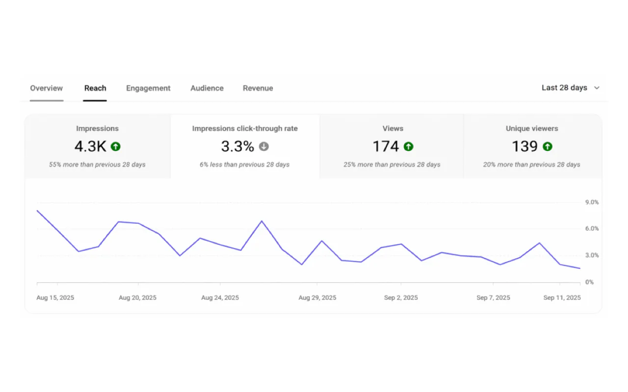
48-hour check: Review early CTR signals in YouTube Studio (Analytics > Reach)
14-day review: Test completes — record the winner and the variable that drove it
Monthly audit: Across all tests that month, identify which design variable had the largest impact on your audience. Double down on that variable in next month's thumbnails
Quarterly: Revisit your top 10 videos and re-test their thumbnails with updated AI-generated variants — viewer preferences shift over time
Tracking Results
Build a simple test results log:
Video
Date
Variable Tested
Winner
CTR Lift
Insight
Video title
2026-07-01
Expression
Variant B (confident)
+18%
Audience prefers confidence over shock
Video title
2026-07-08
Color
Variant C (yellow-purple)
+12%
Purple stands out in tech niche
After 10 tests, clear patterns emerge. After 30 tests, you have a data-driven playbook specific to your audience — something no generic guide can provide.
The Iterative Optimization Workflow
Thumbnail design is not a one-and-done task. Your thumbnail design process should include a systematic optimization loop. Here is the workflow I use for continuous improvement:
48-hour check: Review CTR in YouTube Studio (Analytics > Reach) within 48 hours of publishing
Below 4% CTR: Consider replacing the thumbnail (YouTube allows changes at any time)
Monthly review: Identify your 5 highest-CTR videos and analyze what their thumbnails share in common
A/B testing: Use YouTube's native Test and Compare feature on every important video
Even small differences — a slightly larger font, a different background color, or a shifted facial expression — can produce statistically significant results after a few thousand impressions. I run Test and Compare on every video that matters.
AI-powered refresh workflow for underperforming videos:
When a video falls below 4% CTR, do not just guess at a replacement. Use this systematic AI refresh process:
Identify which of the 7 principles the current thumbnail violates (usually 2-3 gaps are obvious)
Write a new prompt that explicitly addresses those gaps
Generate 3 variants
Upload the best as a replacement — YouTube gives refreshed thumbnails a new distribution signal
Quarterly competitor audit: Once a month, spend one hour on a structured thumbnail review. Search your five core keywords, screenshot the top 10 thumbnails for each, and score them against the seven design principles from this guide. You will find that the top three results almost always satisfy all seven principles, while lower-ranked results clearly fall short on several. This kind of quantitative analysis is more useful than intuitive judgment — it reveals exactly where your own thumbnails need improvement.
Ready-to-Use Prompt: Design a High-CTR YouTube Thumbnail Via 7 Principles + A/B
What this does: Scores a thumbnail concept against the seven CTR principles, applies composition/color/typography fixes for the weak ones, generates five distinct AI variants, and sets an A/B test with a win criterion — so you test five bets instead of guessing on one. Based on: YouTube Thumbnail Design: 7 Principles That Actually Boost CTR (With AI Workflows) — https://aiworkflowpro.com/how-to-design-clickworthy-youtube-thumbnails/ Time to run: ~5 minutes
Copy this prompt into Claude Code, ChatGPT, or any AI assistant:
ROLE: You are a YouTube Thumbnail Design Architect. Your job: turn a video topic into a high-CTR thumbnail by scoring the seven principles, fixing the weak ones, and A/B-testing five AI variants — never shipping a single guess.

CONTEXT — 7-PRINCIPLE THUMBNAIL + AI A/B METHOD:
A thumbnail is not a frame grab — it is the video's first handshake, and in a feed of 500+ hours uploaded every minute it decides whether anyone stops scrolling. The gap between a 3K-view and a 300K-view thumbnail is design principles plus the AI workflow to test five variants instead of guessing on one. Seven principles drive CTR: (1) one focal point; (2) high contrast, readable tiny; (3) big emotion or expressive face; (4) minimal text, three words max; (5) a curiosity gap or visual question; (6) brand consistency; (7) legibility at mobile-feed size, not full screen. Apply composition, color theory, and typography to satisfy the weak principles, then generate five AI variants and A/B test — never ship a single guess.

INPUTS (fill in before running):
- VIDEO_TOPIC: [What the video is about]
- NICHE: [The channel niche]
- CURRENT_THUMBNAIL: [What you have now — or "none"]
- AI_TOOL: [GPT Image / Midjourney / Ideogram / Canva AI]

METHOD — 4 STEPS:

Step 1 — Score the Concept Against the 7 Principles (0–2)
For the VIDEO_TOPIC concept, score each principle 0–2: one focal point, high contrast, big emotion/face, minimal text (≤3 words), curiosity gap, brand consistency, small-size legibility. Flag any 0 — a 0 is where viewers scroll past.

Step 2 — Apply Composition, Color, and Typography
For every principle scoring 0–1, pick the fix: composition (rule of thirds, leading lines, foreground-background, negative space, scale contrast), color (high-contrast, limited palette), or typography (bold, few words, high legibility). Match the treatment to NICHE.

Step 3 — Generate Five AI Variants
Using AI_TOOL, produce five distinct variants that each satisfy all seven principles but differ in focal point, emotion, or curiosity angle — so the A/B tests different bets, not five clones.

Step 4 — A/B Test and Iterate
Pick two variants to A/B against each other (and against CURRENT_THUMBNAIL). Set the win criterion (CTR after a fixed impression window), promote the winner, and keep the iterative loop: re-test the winner against a new variant next cycle.

RULES:
- Never ship a single thumbnail — generate five and A/B test, because the 3K-vs-300K gap is decided by testing, not guessing.
- Never let text lead the thumbnail — minimal text (≤3 words) supports the image; it does not carry it.
- Never design for full screen — design for the mobile feed at thumbnail size; if it fails small, it fails.

OUTPUT FORMAT:
Output a markdown report with:
1. 7-Principle Scorecard — markdown table, columns: Principle | Score (0–2) | Fix
2. Composition + Color + Typography — the chosen treatments matched to NICHE
3. Five AI Variants — markdown table, columns: Variant | Focal Point | Emotion | Curiosity Angle
4. A/B + Iterate Plan — the two variants to test + win criterion + next-cycle loop
Save as @templates/how-to-design-clickworthy-youtube-thumbnails.md and run for every video thumbnail — never ship a single guess.
Can I design good thumbnails without a design background?
Absolutely. Thumbnail design is not about artistic talent — it is about information communication. You need to answer two questions: "What message does this image convey?" and "Can a viewer decode it in one second?" AI tools like GPT Image and Canva AI eliminate the technical barrier entirely. Describe what you want in plain English, apply the principles from this guide, and the tools handle the execution. I started with templates and only developed a distinctive style over time through iteration.
How do I use AI to make better YouTube thumbnails?
Use AI at three levels. First, generation: tools like GPT Image, Midjourney, and FLUX create base images from text prompts. Encode the 7 design principles directly into your prompts — specify composition, contrast, emotion, and text space. Second, post-production: Canva AI handles text overlay, background removal, and brand-consistent templating. Third, testing: generate 3-5 variants per video with isolated design variables, then A/B test with YouTube's Test and Compare. The compound effect of systematic testing with AI-generated variants produces CTR improvements that manual design cannot match.
Should thumbnail text repeat the title?
Never. Thumbnail and title should be complementary, not redundant. An effective combination: the title delivers the core promise while the thumbnail conveys an emotion or visual proof. "How I Edited a Full Video in 3 Minutes" as the title, paired with a dramatic before/after thumbnail showing the transformation. Together they deliver double the information density of either one alone.
What is the difference between portrait and landscape thumbnail strategies?
Portrait (vertical) thumbnails display larger in feeds and can hold more detail. Landscape thumbnails appear at fingertip size on YouTube's feed and must be aggressively simplified. For landscape: limit visual elements to three and text to five words. For portrait: you can extend to four visual elements and eight to ten words. The core test remains the same — shrink it to display size and verify that everything reads clearly.
Which AI tool should I use for thumbnail faces?
For photorealistic faces, use real photos — viewers detect AI-generated faces and trust them less (22% lower long-term click satisfaction). Use AI to generate the background and scene elements, then composite your real face in Canva or Photoshop. For stylized/cartoon faces (gaming, comedy, animation channels), Midjourney V7 with --style raw produces excellent results. For character consistency across episodes, use Midjourney's --cref parameter to maintain the same character appearance.
What to Do Right Now
Open your five most recent videos. Evaluate each thumbnail against the seven principles from this guide. Identify the video with the lowest CTR and list which principles its thumbnail fails to meet.
Then use this process: take those principle gaps, encode them into an AI prompt using the templates above, generate three variants, and upload the best one as a replacement. Mark today's date on your calendar. Check back in two weeks and compare the CTR data. You will see the direct impact of applying principles with AI execution — and that single experiment will teach you more about thumbnail design than reading ten articles, because the data does not lie.
YouTube thumbnail design is one of the most underestimated skills in content creation. AI tools do not change that — they amplify it. The creators who win are not the ones with the best AI tools. They are the ones who understand design principles deeply enough to tell AI exactly what to build. Master the principles first. Then let AI handle the execution at a scale and speed that manual design never could.
Monitoring a competitor who publishes no feed is the case every RSS guide skips. Twenty-one platforms sorted by which of three jobs they do, and the finished setup is business process automation you own outright, with no seat licence to renew.
Blaming the content is the reflex when a post underperforms, and it is usually the wrong diagnosis. A second reader decides distribution before any human sees the post, and most of what it checks is mechanical enough to automate business processes around, on five platforms at once.
Nothing about month four is harder than month three. It is simply the month an unpaid channel starts to feel like proof of failure. Surviving it takes a cadence you can hold while earning nothing, which is a better reason to automate business processes than speed ever was.
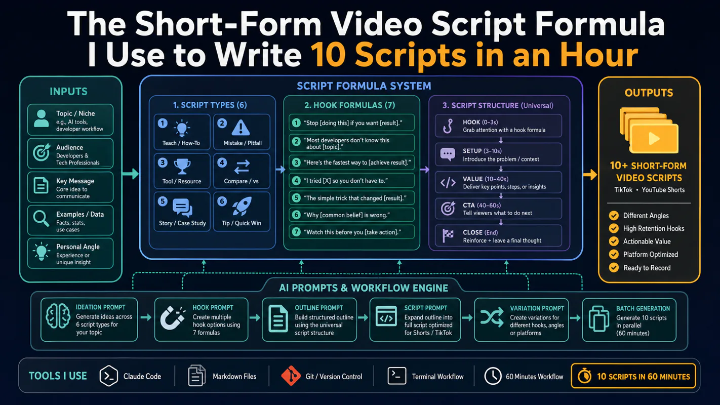
Thursday afternoon, fourteen product ideas, a Monday filming slot, no scripts. Six script shapes and seven hook formulas turn that hour into finished drafts — and the business rule stays: rewrite at least 30% before anything ships.