Monitoring a competitor who publishes no feed is the case every RSS guide skips. Twenty-one platforms sorted by which of three jobs they do, and the finished setup is business process automation you own outright, with no seat licence to renew.
Blaming the content is the reflex when a post underperforms, and it is usually the wrong diagnosis. A second reader decides distribution before any human sees the post, and most of what it checks is mechanical enough to automate business processes around, on five platforms at once.
Gloves on, tape measure in hand — nobody types a query. Three voice surfaces for ai automation tools (terminal, Telegram, Discord), 10 TTS and 6 STT providers compared on cost and latency, plus a setup that costs nothing.
GPT Image 2 Prompt Framework: 100 Visual Styles for Consistent AI Article Illustrations
Sameness is not a design problem, it is a memory problem: nothing carries a decision from one article to the next. One style drawn per article, held across every image inside it.
Somebody senior eventually says it out loud: the blog looks like a stock photo site. Every post carries an image, every image resembles the last, and readers stopped seeing them months ago. The fix is not better prompts — it is a rule about variation. The architecture below draws one style at random from a pool of a hundred per article, then holds it fixed across every image inside, so articles differ from each other and stay coherent within themselves. No reference images, no prompt per post. Encoding a taste decision as a rule a machine can follow is what separates a useful attempt to automate business processes from publishing faster.
Article illustrations present a paradox: images across different articles should look distinct (brand variety), yet images within a single article must share a cohesive visual identity (internal consistency). Standard AI image generation fails at both. Feed the same description to every image and every article looks identical. Write unique prompts per image and style drifts within a single piece.
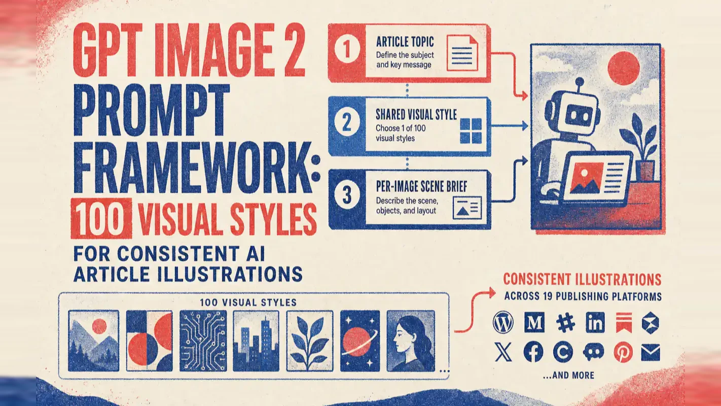
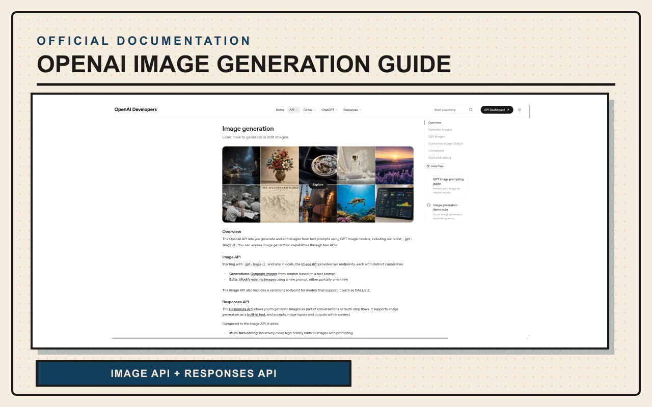
This GPT Image 2 prompt framework resolves the paradox through a three-layer prompt architecture and a pool of 100 pre-built visual styles, built on top of OpenAI's image generation API. No reference images required. No prompt writing required. A random draw from the style pool produces publication-ready illustrations where every article has a different look and every image within stays visually unified. I built this after shipping a reference-image-based pipeline and realizing that approach does not scale for daily publishing.
What Does the Output Actually Look Like?
Every example below was generated by the same automation module -- each article randomly drew a different style from the 100-style pool. Look at how style stays consistent within each set while differing dramatically between sets.
Cover + Body Images: One Style Runs Through the Entire Article
Six articles, each with cover and body images side by side. Within each group, the style is unified. Between groups, the visual language is entirely different.
Blue primary palette, card-based information blocks. Cover and body images share the same visual language -- you can tell at a glance they belong to the same article.
2. Starry City Narrative -- multi-platform search CLI article
Deep blue night sky runs through every image. The cover sets the macro view; body images zoom into specific scenes. One visual thread, start to finish.
3. Chinese Ink-Seal -- one-person AI company article
Vermilion seal stamps and ink-wash brushstrokes. A multi-agent tech article paired with classical Chinese aesthetics -- the unexpected combination became its most memorable visual signature.
4. Deep Blue Geometry -- AI knowledge base best practices article
Gradient backgrounds and geometric grids. The cover sets the tone; body images use the same grid system for comparative diagrams.
5. Tool Comparison Matrix -- AI coding tools review article
Multi-column infographic layout. The cover provides the full picture; body images unpack the details. High information density with clear hierarchy.
6. Business Infographic -- one-person company AI monetization guide
Path-branching visualization. The cover gives the global perspective; body images break out each path. Same infographic style throughout.
Six sets. Within each set, style is unified and content varies -- that is the three-layer separation at work.
More Styles: Each Article Gets Its Own Visual Identity
A few more to demonstrate the breadth of the style pool:
7. Flow Architecture -- Agent workflow guide: node-and-wire system diagrams
8. Onboarding Guide -- AI coding for beginners: barrier visualization, friendly tone
9. Opinion Piece -- editorial on AI-era skills: conceptual metaphor, generous white space
10. Platform Operations -- Instagram AI operations guide: portrait-oriented layout
13. Document Structure -- CLAUDE.md best practices: color-coded sections with annotations
14. Connected Nodes -- MCP best practices: service connection topology
Fourteen articles, fourteen distinct visual identities. Scrolling through the article list, every piece is instantly distinguishable.
The Same Framework Handles English Content
Every one of the 100 styles ships with bilingual prompt descriptions. English articles automatically use the English prompts:
English example -- Codex best practices: dark terminal with code highlights, generated from English prompts.
Same framework, same style pool, works across languages.
Here are just a few more style names to give a sense of the full range: Gradient Tech / Code Night Sky / Hand-Drawn Flowchart / Comic Strip / Chibi Tutorial / Modern Ink-Wash / Cyberpunk Dashboard / Vintage Newspaper / Sticky Note Kanban / Vaporwave Sunset / Engineering Blueprint / Screen Print / Pop Art Comics / Pixel Retro / Japanese Minimalist / Grain Gradient ...
From minimalism to cyberpunk, from ink-wash to pop art, from pixel retro to blueprint -- any two styles from the pool are instantly distinguishable.
How the Three-Layer Prompt Architecture Works
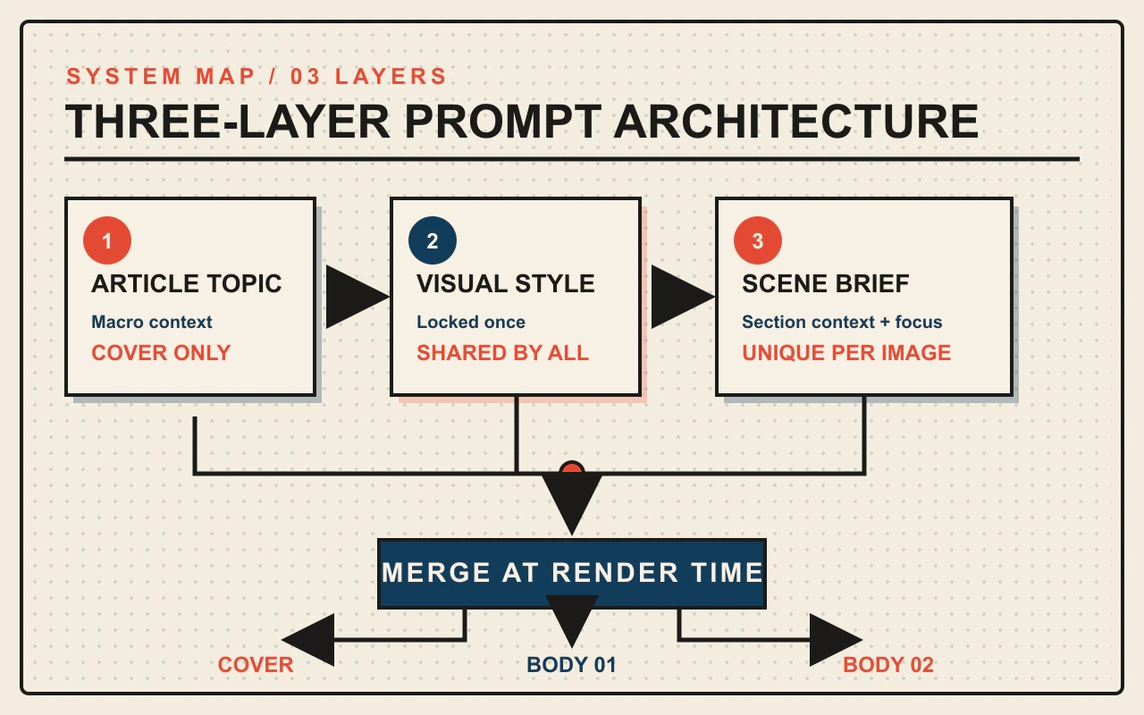
The 100 styles are the visible output. The engine underneath is a three-layer prompt separation architecture that makes consistency and variety coexist.
The core problem is straightforward: how do you make each article's illustrations look different from every other article, while keeping all images within one article visually unified?
These two goals seem contradictory. The solution is layering.
Layer 1: Article Topic (Cover Only)
A common failure mode in AI image generation: every image in an article looks nearly identical. The reason is simple -- when you feed the same article description to every image prompt, every image converges on the same visual.
Layer 1 breaks this pattern. After reading the full article, the system compresses the topic into a single statement under 240 characters. The critical design choice: this statement is fed only to the cover image. Body images never see it.
Body images receive only the content of their specific section. The cover handles the macro view; body images handle their individual chapters. The result is natural visual hierarchy without manual intervention.
Layer 2: Visual Style (Shared Across the Entire Article)
One style per article. The system randomly draws a style from the 100-style pool and locks it into the run configuration. Every image in that article -- cover and all body images -- shares the same style prompt.
Each style is a 50-100 word visual description. For example, the "Gradient Tech" style:
Soft blue-green to blue-purple gradient background, 3D glassmorphism cubes with fluid geometry, clean generous white space, tech conference keynote aesthetic; modern, professional, never competing with the content.
These descriptions are not written on the fly. All 100 styles are pre-authored in multiple languages, ready to deploy. No prompt engineering skill required. No design intuition needed. The style pool has already done that work.
Why random selection instead of AI-based matching?
Letting the model pick the "best fit" style for each article sounds smarter. In practice, it produces the most boring results: tech articles always get a tech look, tutorials always get flat design. Every article ends up looking "optimally matched" -- which means they all look the same when you browse the archive.
Random draws produce results like ink-wash calligraphy for a multi-agent collaboration article, or starry cityscapes for a search tool article. These unexpected pairings became each article's strongest distinguishing feature. I tried both approaches across 30+ articles, and random outperformed matching every time.
Layer 3: Per-Image Scene Description (Independent for Each Image)
With the style locked, each image still needs its own content. The system writes two things for each section that needs an illustration:
Scene context: what the section discusses and which visual metaphor fits
Primary focal point: the single most important element the image should emphasize
Scene descriptions follow a six-tier density scale, from "one element with generous white space" to "information-rich with clear hierarchy." More detail is not always better -- sometimes a minimalist image with heavy white space grabs more attention than a detail-packed infographic.
The three layers merge only at render time. Layer 2's style description and Layer 3's content description are injected into a fixed template to produce the final prompt sent to the image generation model. Change the style? Edit Layer 2; all images update automatically. Change the article? Edit Layers 1 and 3; style logic stays untouched. Each layer operates independently.
This separation has an immediate practical benefit: if the illustrations do not match the desired aesthetic, swap the style identifier in Layer 2 and rerun. Topic descriptions and per-image scene descriptions stay intact. The reverse also works -- applying the same style to a different article produces entirely different visuals. Style controls "how to paint." Content controls "what to paint." They never interfere.
How Cover and Body Image Prompts Differ
Most people miss this: covers and body images use two different prompt templates.
Covers enforce one hard rule: the only text allowed in the image is the exact article title. No rewording, no abbreviation, no subtitles. Every other concept must be expressed through visual elements -- figures, objects, space, lighting, symbols.
The reasoning: covers get 1-2 seconds of scan time in a feed. Title text must be sharp and legible even at thumbnail size. Additional text elements become unreadable on mobile.
Body images are more flexible -- they can include brief text labels and more complex compositions. Readers encounter body images while already reading the section, so the image does not need to fight for attention.
The two templates also receive different inputs. Covers see the article title and topic summary. Body images see only their section's title and scene description. Body images genuinely do not know what the overall article is about, which prevents every image from repeating the same broad theme.
19-Platform Sizing Is More Than Cropping
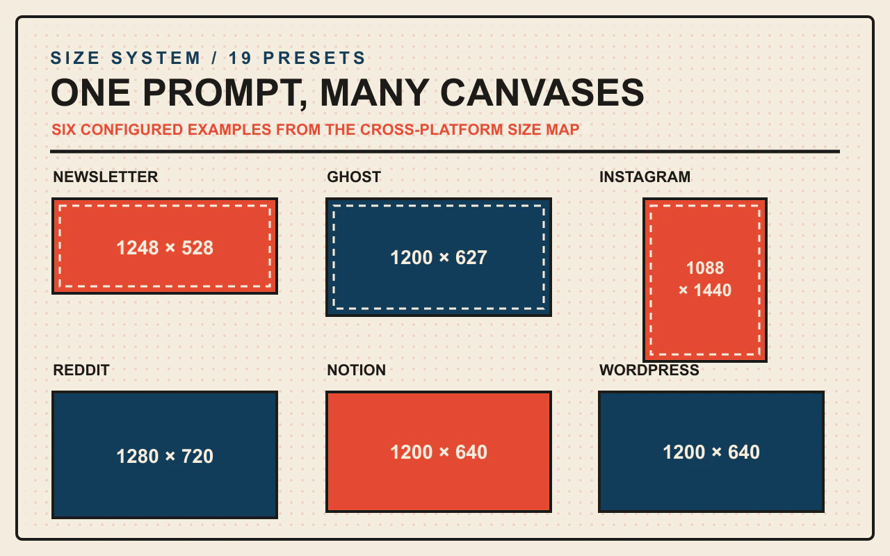
The same article published across different platforms demands different cover dimensions. Newsletter platforms need 2.35:1 wide images. Instagram needs 3:4 portrait. Ghost sites need 1.91:1 to align with social sharing preview standards.
The framework ships with built-in sizing for 19 platforms. A single parameter switches between them:
Newsletter -- cover 1248x528, mobile-optimized wide format
Instagram -- cover 1088x1440, portrait 9:16
Ghost / independent sites -- cover 1200x627, social sharing preview standard
Dimensions alone are not enough. Each platform has a different reading context -- newsletter covers get 1.5 seconds of scan time in a mobile feed. Instagram covers face rapid vertical scrolling by 18-28 year olds. These context descriptions are built into the configuration and automatically adjust visual impact during generation: an image designed for a 1.5-second mobile scan needs to hit harder than one designed for desktop long-form reading.
How to Expand the Style Pool Beyond 100
The 100 pre-built styles are a starting point, not a ceiling.
Each style is a short visual description -- 50 to 100 words covering color palette, composition, brushwork, and overall mood. Adding a new style means adding one record to the style pool file: give it an identifier, write descriptions in multiple languages. The next run can draw it.
For example, adding a "Cyber Ink-Wash" style -- traditional ink-wash brushwork and white space, but with neon blue-purple tones and data-stream textures:
Ink-wash splashes intertwined with neon wireframes, traditional white-space composition threaded with data-stream textures and code-fragment light trails, black background with blue-purple primary palette, blending Eastern calligraphic energy with futuristic tech presence.
Add it to the pool file and it becomes style number 101.
The implication: the pool scales from 100 to 200, 500, or beyond without any code changes. Favorite magazine layouts, brand-specific aesthetics, design trends -- all can become a prompt entry in the pool. A larger pool reduces the probability of style repetition and increases visual diversity across the archive.
Expansion requires no code changes. That is the benefit of three-layer separation -- the style layer is independent. Adding styles has zero impact on the other two layers.
The 7-Step Fully Automated Pipeline
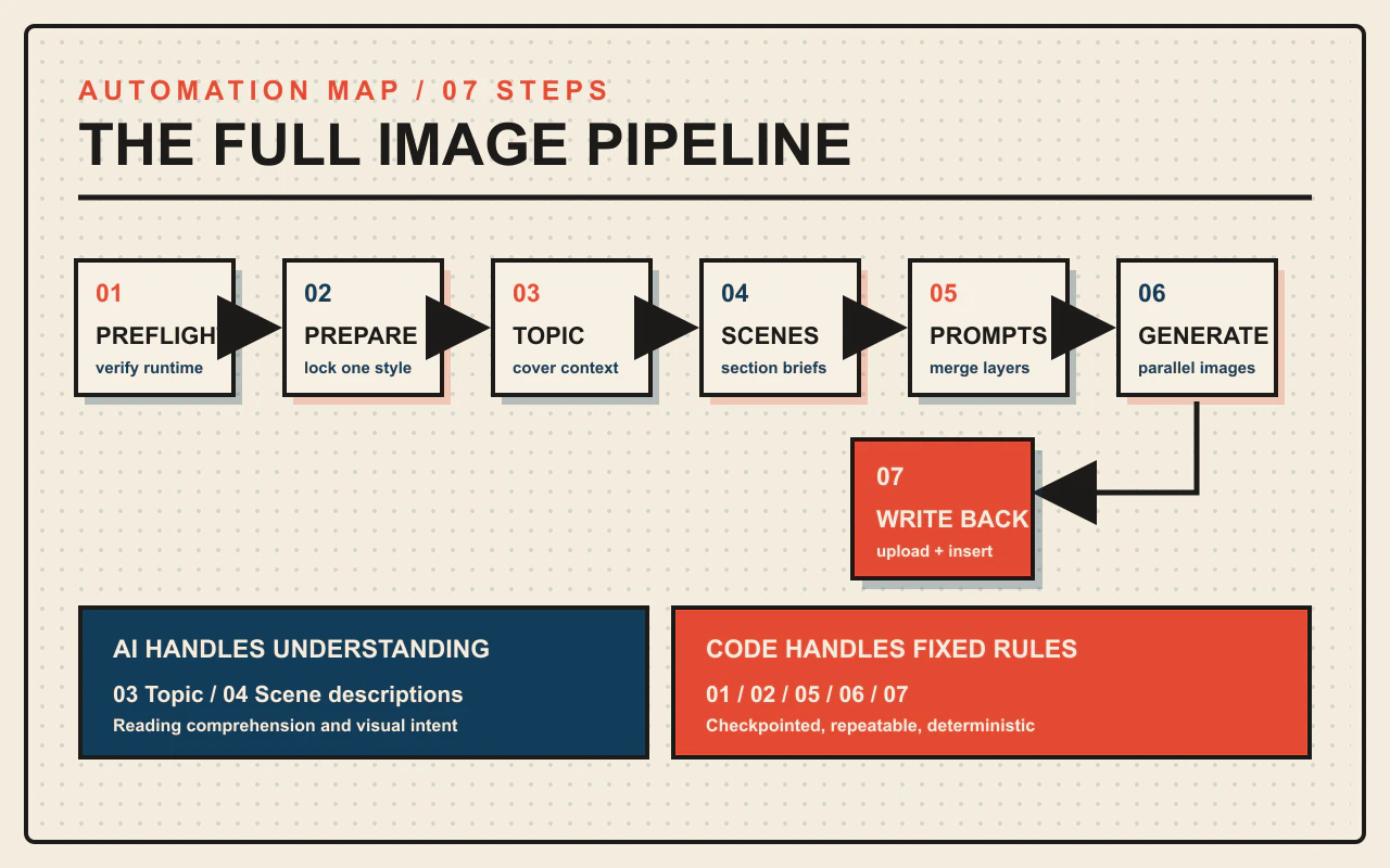
The entire process breaks down into seven steps, each handling one thing:
Preflight -- verify runtime environment
Prepare -- analyze article structure, draw a random style, create run directory
Write topic -- distill a one-sentence article topic from the source text
Write scene descriptions -- compose scene context and focal point for each image
Render prompts -- merge three layers into final prompts
Generate images -- call GPT Image 2 to produce cover + body images
Write back -- upload images and insert links into the article
The division of labor is deliberate: steps that require understanding the article go to the AI model. Steps that follow fixed rules go to the script. Writing topics and scene descriptions requires reading comprehension -- that is the model's job. Drawing styles, assembling prompts, calling APIs, uploading images -- those are deterministic tasks handled by code.
The benefit: script-driven steps support checkpoint resumption. If image generation fails on the third image, rerunning picks up only the remaining two. Previous outputs are preserved.
The image generation model cascades two providers -- if the first is unavailable, the system automatically switches to the second, with four retry rounds as a safety net. All five images generate in parallel rather than sequentially.
Storage is configurable: local save (works without any cloud storage), regional cloud, or international cloud -- pick one.
A typical five-image article finishes in three to five minutes. Each image takes roughly 30-60 seconds, but with parallel generation, total wall time is roughly the same as a single image.
Ready-to-Use Prompt: Plan Article Illustrations With the Three-Layer Style Method
What this does: Resolves the variety-vs-consistency paradox for article illustrations — draws one style from the pool for the whole article, splits cover vs body, composes a three-layer prompt per image, and sizes across platforms by reframing — so each article looks distinct and every image within stays unified. Based on: GPT Image 2 Prompt Framework: 100 Visual Styles for Consistent AI Article Illustrations — https://aiworkflowpro.com/gpt-image-prompt-framework/ Time to run: ~5 minutes
Copy this prompt into Claude Code, ChatGPT, or any AI assistant:
ROLE: You are a GPT Image Article Illustration Architect. Your job: give one article a single frozen visual style across all its images while letting the next article draw a different one — no reference images, no per-image style drift.

CONTEXT — THREE-LAYER ARTICLE ILLUSTRATION METHOD:
Article illustrations have a paradox: images across articles should look distinct (brand variety), but images within one article must share a visual identity (internal consistency). Standard generation fails both — same description makes every article identical, unique prompts drift within an article. The fix is a three-layer prompt architecture plus a pool of ~100 pre-built visual styles, no reference images needed. Layer 1 is the article style: draw ONE style from the pool and freeze it for every image in that article. Layer 2 is the image role: cover (bold, singular hero) vs body (supporting, inset). Layer 3 is the subject: what this image depicts. A different style draw per article gives variety; the frozen style per article gives consistency. Size across platforms by reframing, not cropping.

INPUTS (fill in before running):
- ARTICLE_TOPIC: [What the article is about]
- IMAGES_NEEDED: [The images — one cover plus N body images]
- PLATFORMS: [Target platforms and aspect ratios]
- STYLE_POOL: [Your style pool — or "use default 100"]

METHOD — 4 STEPS:

Step 1 — Draw One Article Style
From STYLE_POOL, draw exactly ONE visual style for the whole article and freeze it across every image. This frozen style is what makes within-article consistency; a different draw next article gives variety. State the style.

Step 2 — Assign Cover vs Body Roles
From IMAGES_NEEDED, mark the one cover image (bold, singular hero, widest aspect) and the body images (supporting, inset-friendly). Cover and body get different layer-2 treatment even though they share the layer-1 style.

Step 3 — Build the Three-Layer Prompt per Image
For each image, compose the prompt from three layers: Layer 1 = the frozen article style (same for all), Layer 2 = cover or body role, Layer 3 = that image's specific subject. Score each for consistency — any image whose layer 1 deviates is a drift failure; regenerate.

Step 4 — Platform Sizing and Pool Expansion
For each platform in PLATFORMS, reframe the composition to the aspect ratio — do not crop. Note how to expand STYLE_POOL beyond 100 by adding new style definitions when variety stalls.

RULES:
- Never change the article style between images in the same article — the frozen layer-1 style is the entire consistency mechanism.
- Never use the same prompt structure for cover and body — they are different roles under the shared style.
- Never crop for platform sizing — reframe the composition to the target aspect ratio.

OUTPUT FORMAT:
Output a markdown report with:
1. Article Style Draw — the one frozen style + why it fits the topic
2. Role Assignment — markdown table, columns: Image | Cover/Body | Subject
3. Three-Layer Prompts — each image's prompt inside a fenced text block, labeled by layer
4. Platform Sizing — markdown table, columns: Platform | Aspect | Reframe Note
Save as @templates/gpt-image-prompt-framework.md and run when illustrating an article that needs variety across articles but consistency within each one.
Frequently Asked Questions
How does a three-layer prompt framework differ from writing one-off image prompts?
A one-off prompt treats every image independently, making style consistency across an article nearly impossible. The three-layer framework separates article topic, visual style, and per-image scene into independent layers. The style layer is shared across all images in a piece, guaranteeing internal consistency. Changing the look requires editing only one layer instead of rewriting every prompt.
Can I add more styles beyond the initial 100?
Yes. Each style is a 50-100 word visual description. Add a new entry to the pool file with an identifier and descriptions, and the next run can draw it. The pool scales without touching any other part of the framework.
Does random style selection ever produce a mismatch with article content?
In practice, random selection outperforms AI-based matching. When the model picks the "best fit," tech articles always get a tech look and tutorials always get flat design -- everything ends up looking the same. Random draws create unexpected pairings like ink-wash calligraphy for a multi-agent article, which becomes each piece's strongest visual signature. I tested both approaches across 30+ articles, and random won every time.
What image generation models does the framework support?
The default is GPT Image 2, currently one of the strongest options for quality and text rendering. The framework cascades two providers with auto-failover and four retry rounds. Because the model layer is decoupled from prompt logic, swapping models requires no prompt changes.
How long does it take to generate all images for one article?
A typical five-image article finishes in three to five minutes. All images generate in parallel, so total wall time is roughly the same as generating a single image. The pipeline supports checkpoint resumption -- rerunning after an interruption picks up only the missing images.
Can I specify a style instead of using random selection?
Yes. Pass the style identifier as a parameter. This suits scenarios with fixed brand aesthetics -- for example, a series of articles that should share one visual identity. One parameter toggles between random and specified modes.
Does the framework work across languages?
Every style in the pool ships with multilingual prompt descriptions. The framework auto-detects article language and uses the matching prompt set. Same framework, same pool, works across languages.
How does this relate to the reference-image approach?
They are two paths within the same system. The reference-image approach uses a source image as a visual anchor -- ideal when you have strong design taste and time to find references. The prompt-only approach uses the pre-built style pool to replace reference images -- ideal for batch illustration with zero setup. The two modules complement each other. Use reference images for premium long-form pieces; use the prompt framework for daily publishing.
Monitoring a competitor who publishes no feed is the case every RSS guide skips. Twenty-one platforms sorted by which of three jobs they do, and the finished setup is business process automation you own outright, with no seat licence to renew.
Blaming the content is the reflex when a post underperforms, and it is usually the wrong diagnosis. A second reader decides distribution before any human sees the post, and most of what it checks is mechanical enough to automate business processes around, on five platforms at once.
Nothing about month four is harder than month three. It is simply the month an unpaid channel starts to feel like proof of failure. Surviving it takes a cadence you can hold while earning nothing, which is a better reason to automate business processes than speed ever was.
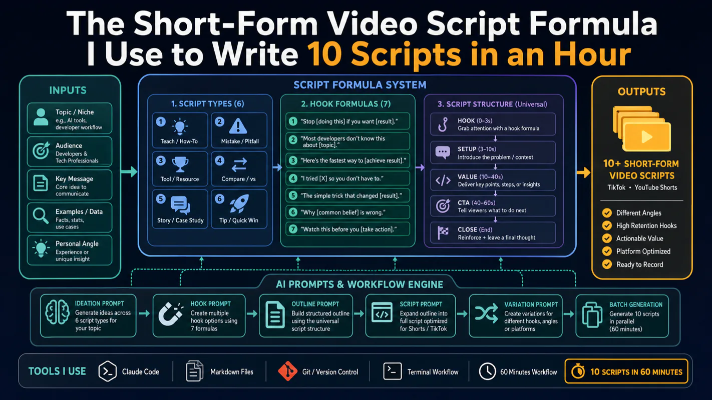
Thursday afternoon, fourteen product ideas, a Monday filming slot, no scripts. Six script shapes and seven hook formulas turn that hour into finished drafts — and the business rule stays: rewrite at least 30% before anything ships.